Usage Examples
What does Wiki's Markdown/Rich Text Engine actually support?
It supports block level and inline level elements for showing information to users. These include formatting, custom logic (as such in the case as links), and sizing.
Block Level Markdown
| Element | Syntax / Tag | Description & Behavior |
|---|---|---|
| Headings | # H1 through ###### H6 |
Collapsible by default. Append {flat} or {nocollapse} after the text to opt out. |
| Lists | -, *, + or 1. |
Supports unordered (-, *, +) and ordered (1.) lists. |
| Checklists | - [ ] text / - [x] text |
Persisted checkmark boxes that fire an "All checks complete!" banner when all items are checked. |
| Blockquote | > text |
Consecutive lines join with a space. |
| Rule | ---, ***, ___ |
Horizontal divider rendered with 3 or more matching characters in a row. |
| Tables | Standard pipe syntax | Header row, \| - \| - \| separator row, followed by data rows. |
| Footnotes | [^1]: text / [^1] |
Defined anywhere and referenced inline. Supports guarded/conditional variants ([^1?condition]:) with unconditioned fallbacks. |
| Collapsible Details | Title / :::spoiler |
Expandable container that opens on click. |
| Loading Callout | Title |
Same as details, but displays "⚛ Consulting the reactor…" for ~550ms before content appears. |
| Hotspots | ns:path,W,H |
A clickable-hotspot image using @x,y tooltip text lines inside. |
| Scaling | {scale:X} |
Placed on its own line to scale everything after it until reset. |
Customized callouts.
There are also some more "special" callouts.
Container Type (:::type) |
Aliases | Description & Behavior |
|---|---|---|
| Warning | :::warning, :::warn |
Callout for warnings and cautions. |
| Danger | :::danger, :::error |
Callout for errors and critical dangers. |
| Tip | :::tip, :::success |
Callout for helpful tips and successes. |
| Note | :::note, :::info |
Callout for general notes and information. |
| Skill Issue | :::skill_issue, :::skillissue |
Callout for user errors. |
| Cope | :::cope, :::copium |
Callout for coping statements. |
| Details / Spoiler | :::details, :::spoiler |
Collapsible container with a title, click to expand. |
| Generic (Any other type) | Any custom string | Renders generically with a purple dot icon and a title-cased label for free extensibility. |
Code Blocks: Supports lang tags and renders a button on the right side that is clicked to copy.
```js ```
Current languages supported are: JavaScript, Rust, Hot Chocolate, Python, TypeScript, C, C++, C#, Kotlin, and Java.
More can be added, if you want to learn how to do that check out Language Parsing.
Inline Markdown
| Element | Syntax / Tag | Description & Behavior |
|---|---|---|
| Text Styling | **bold**, *italic*, ~~strikethrough~~, ==highlight==, `code` |
Standard formatting. Code spans are click to copy.. |
| Keycap | <kbd>Ctrl</kbd> |
Renders a styled keycap. |
| Colors & Scaling | {#RRGGBB}text{reset}, {scale:N} |
Hex color runs and inline scaling (applies inline as well as on its own line). |
| Smart Quotes | " |
Auto-alternates open/close curly quotes (skipped inside code spans). |
| Inline Image | [img:ns:path,W,H] |
Inline image with optional width and height (defaults to 48×48). |
| Item Icon | [item:ns:id] or [item:ns:id\|tooltip text] |
Renders an item icon with an optional tooltip. |
| Links | [label](url) |
Supports HTTP(S), wiki deep-links (wiki:namespace/basePath#pageId) or hover tooltips (tip:hover text). |
| Image Links | [img:ns:path](anything) |
Allows using an inline image as a clickable link label. |
| 404 Handling | Automatic | Unresolved wiki links or initial deep-links display a themed page with a return link. |
Ingame Visuals
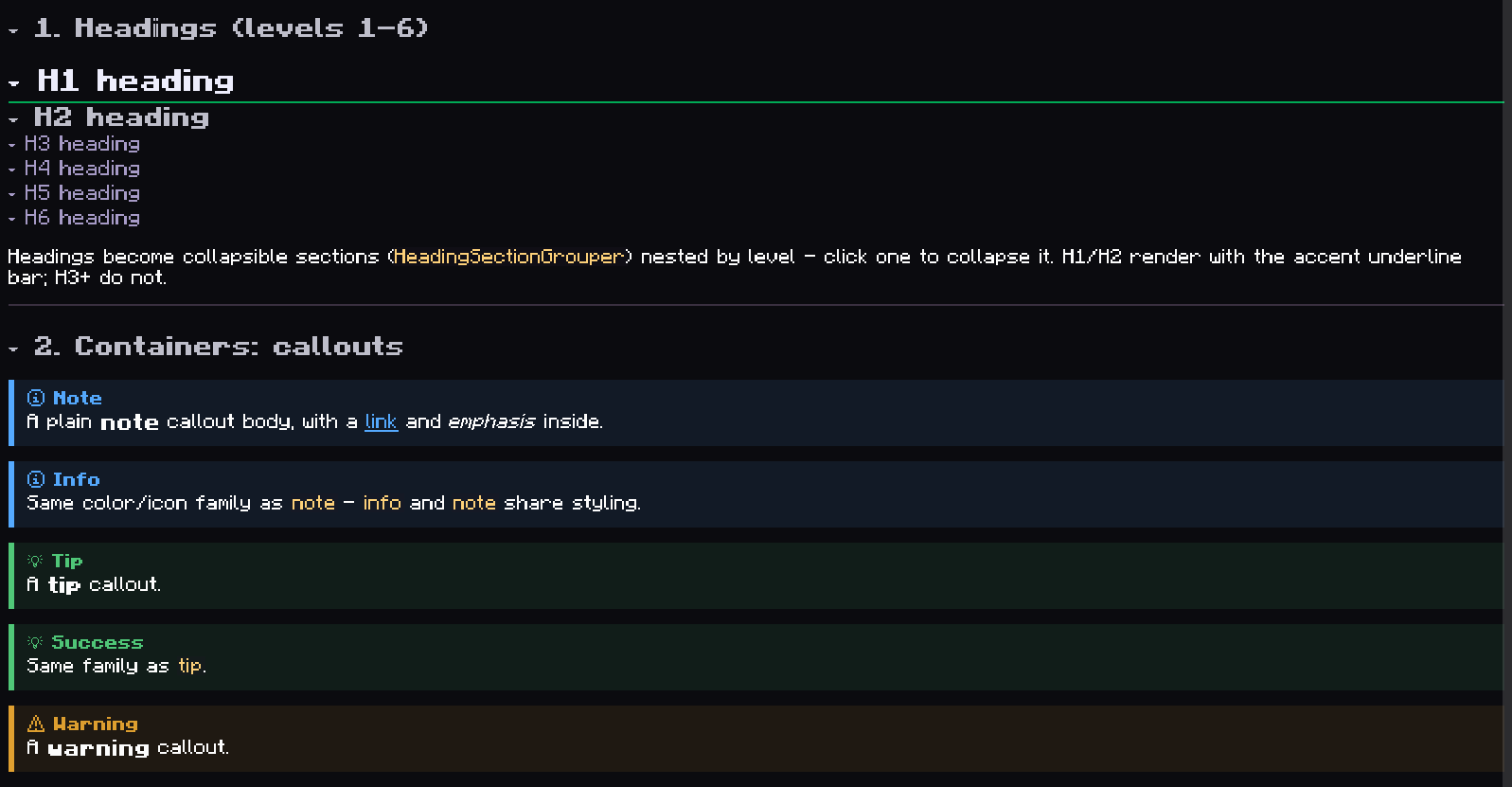
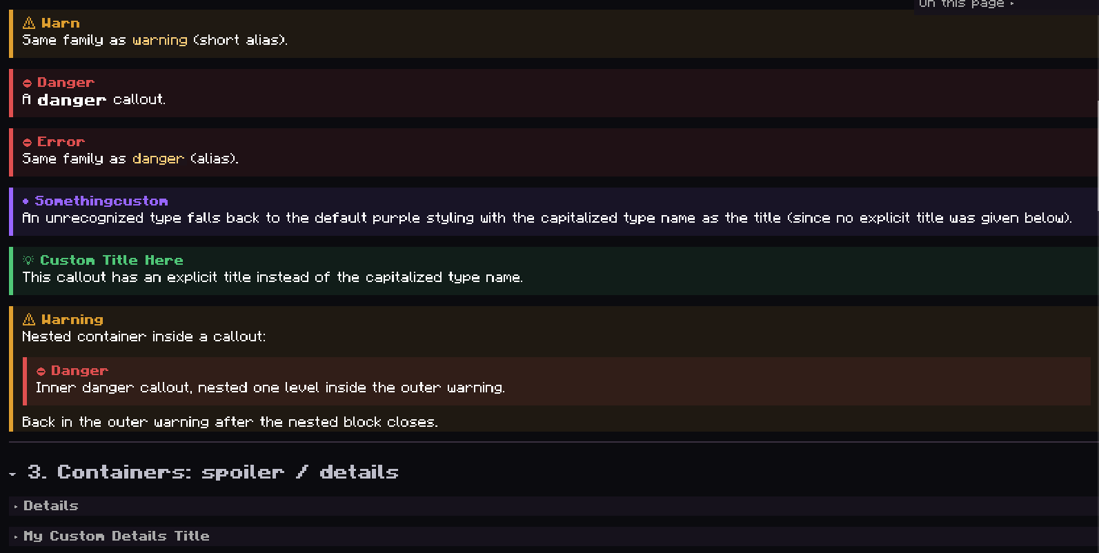
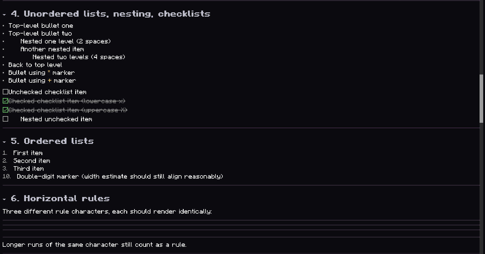
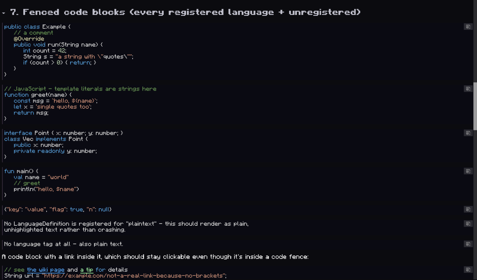
Below is a series of screenshots from ingame and then the actual text behind it.
{scale:1.0}
# Wiki Markdown Test Page
---
## 1. Headings (levels 1-6)
# H1 heading
## H2 heading
### H3 heading
#### H4 heading
##### H5 heading
###### H6 heading
Headings become collapsible sections (`HeadingSectionGrouper`) nested by level - click one to collapse it.
H1/H2 render with the accent underline bar; H3+ do not.
---
## 2. Containers: callouts
:::note
A plain **note** callout body, with a [link](https://www.curseforge.com/minecraft/mc-mods/phoenix-guilds) and *emphasis* inside.
:::
:::info
Same color/icon family as `note` - `info` and `note` share styling.
:::
:::tip
A **tip** callout.
:::
:::success
Same family as `tip`.
:::
:::warning
A **warning** callout.
:::
:::warn
Same family as `warning` (short alias).
:::
:::danger
A **danger** callout.
:::
:::error
Same family as `danger` (alias).
:::
:::somethingcustom
An unrecognized type falls back to the default purple styling with the capitalized type name as the
title (since no explicit title was given below).
:::
:::tip Custom Title Here
This callout has an explicit title instead of the capitalized type name.
:::
:::warning
Nested container inside a callout:
:::danger
Inner danger callout, nested one level inside the outer warning.
:::
Back in the outer warning after the nested block closes.
:::
---
## 3. Containers: spoiler / details
:::spoiler
Default-titled spoiler ("Details") - collapsed by default, click to expand.
:::
:::details My Custom Details Title
A `details`-typed container with an explicit title.
:::
---
## 4. Unordered lists, nesting, checklists
- Top-level bullet one
- Top-level bullet two
- Nested one level (2 spaces)
- Another nested item
- Nested two levels (4 spaces)
- Back to top level
* Bullet using `*` marker
+ Bullet using `+` marker
- [ ] Unchecked checklist item
- [x] Checked checklist item (lowercase x)
- [X] Checked checklist item (uppercase X)
- [ ] Nested unchecked item
---
## 5. Ordered lists
1. First item
2. Second item
3. Third item
10. Double-digit marker (width estimate should still align reasonably)
---
## 6. Horizontal rules
Three different rule characters, each should render identically:
---
***
___
----------
Longer runs of the same character still count as a rule.
---
## 7. Fenced code blocks (every registered language + unregistered)
java
public class Example {
// a comment
@Override
public void run(String name) {
int count = 42;
String s = "a string with \"quotes\"";
if (count > 0) { return; }
}
}
js
// JavaScript - template literals are strings here
function greet(name) {
const msg = `hello, ${name}`;
let x = 'single quotes too';
return msg;
}
ts
interface Point { x: number; y: number; }
class Vec implements Point {
public x: number;
private readonly y: number;
}
kotlin
fun main() {
val name = "world"
// greet
println("hello, $name")
}
json
{"key": "value", "flag": true, "n": null}
A code block with a link inside it, which should stay clickable even though it's inside a code fence:
java
// see [the wiki page](wiki:some-page) and [a tip](tip:hover text here) for details
String url = "https://example.com/not-a-real-link-because-no-brackets";
A code block with a line long enough that it must wrap mid-token at the container width, to exercise the
character-by-character fallback path in `wrapHighlightedLine`:
java
String thisIsADeliberatelyVeryVeryVeryVeryVeryVeryVeryVeryVeryVeryVeryLongIdentifierNameThatCannotPossiblyFitOnOneLine = "value";
Click the copy icon in the top-right of any code block and confirm the clipboard gets the raw, unhighlighted
source (not the colorized tokens).
---
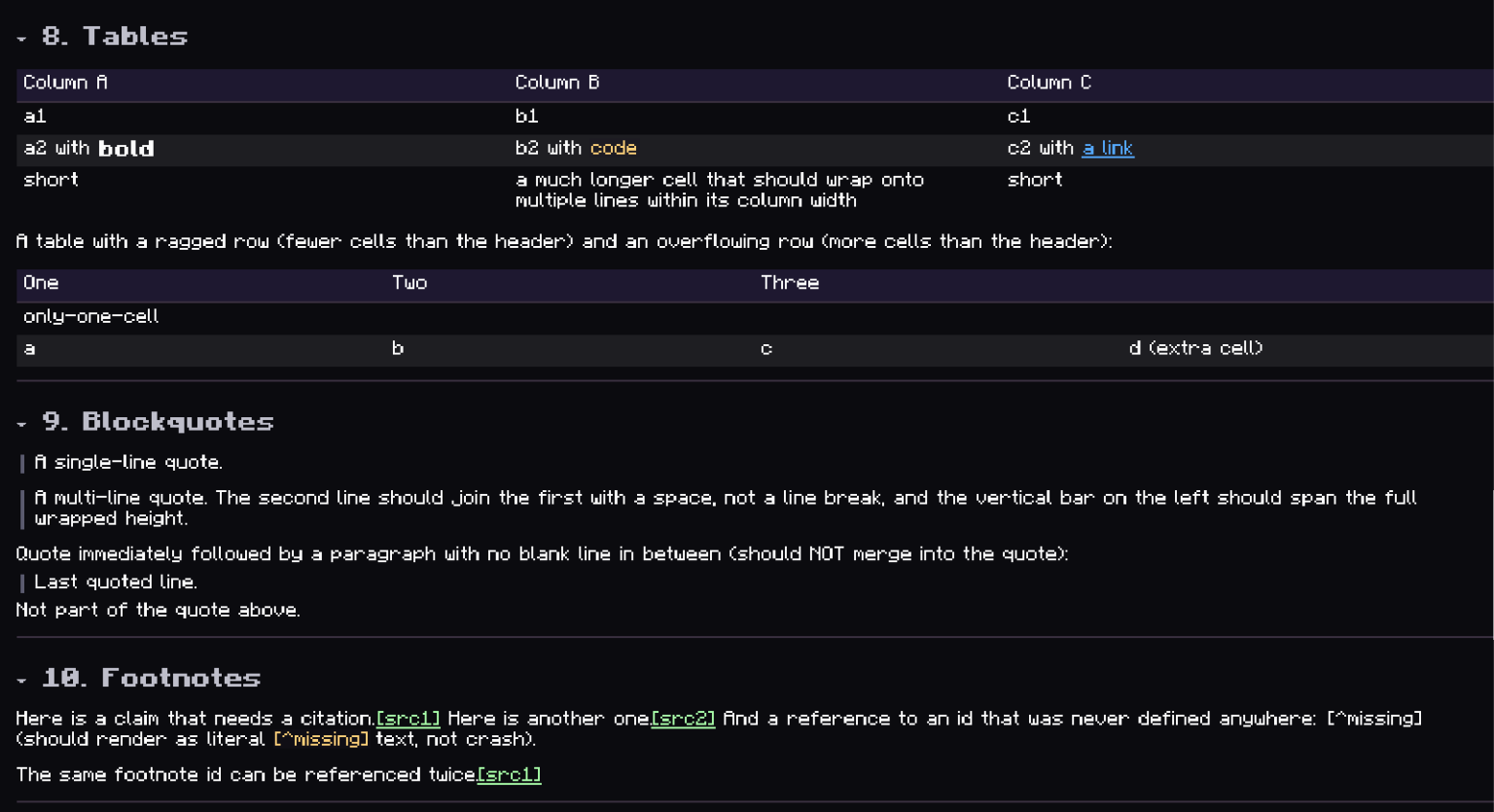
## 8. Tables
| Column A | Column B | Column C |
|----------|----------|----------|
| a1 | b1 | c1 |
| a2 with **bold** | b2 with `code` | c2 with [a link](wiki:x) |
| short | a much longer cell that should wrap onto multiple lines within its column width | short |
A table with a ragged row (fewer cells than the header) and an overflowing row (more cells than the header):
| One | Two | Three |
|-----|-----|-------|
| only-one-cell |
| a | b | c | d (extra cell) |
---
## 9. Blockquotes
> A single-line quote.
> A multi-line quote.
> The second line should join the first with a space, not a line break,
> and the vertical bar on the left should span the full wrapped height.
Quote immediately followed by a paragraph with no blank line in between (should NOT merge into the quote):
> Last quoted line.
Not part of the quote above.
---
## 10. Footnotes
Here is a claim that needs a citation.[^src1] Here is another one.[^src2] And a reference to an id that was
never defined anywhere: [^missing] (should render as literal `[^missing]` text, not crash).
The same footnote id can be referenced twice.[^src1]
[^src1]: This is the first footnote's definition text, shown as a tooltip on hover.
[^src2]: This is the second footnote's definition text.
---
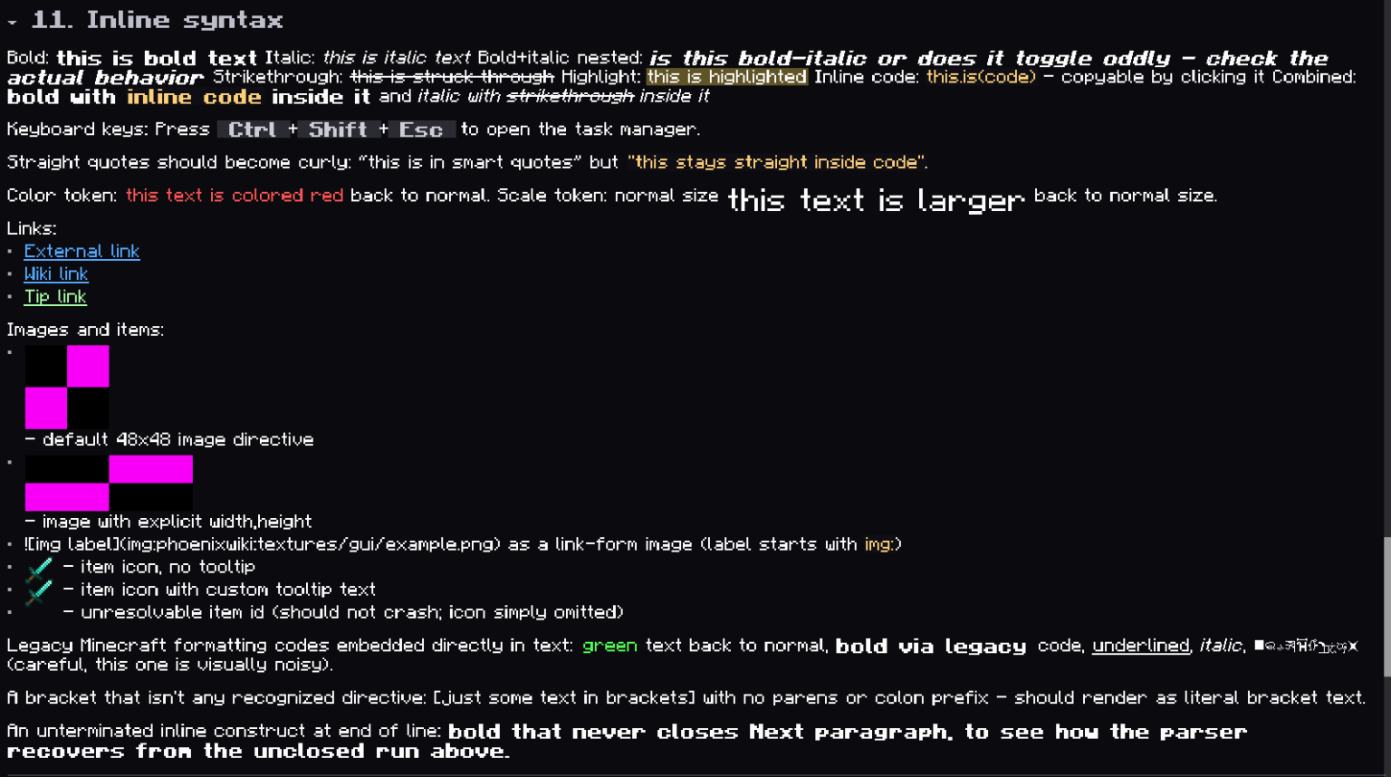
## 11. Inline syntax
Bold: **this is bold text**
Italic: *this is italic text*
Bold+italic nested: ***is this bold-italic or does it toggle oddly - check the actual behavior***
Strikethrough: ~~this is struck through~~
Highlight: ==this is highlighted==
Inline code: `this.is(code)` - copyable by clicking it
Combined: **bold with `inline code` inside it** and *italic with ~~strikethrough~~ inside it*
Keyboard keys: Press <kbd>Ctrl</kbd>+<kbd>Shift</kbd>+<kbd>Esc</kbd> to open the task manager.
Straight quotes should become curly: "this is in smart quotes" but `"this stays straight inside code"`.
Color token: {#FF5555}this text is colored red{reset} back to normal.
Scale token: normal size {scale:1.8}this text is larger{scale:1.0} back to normal size{reset}.
Links:
- [External link](https://example.com/page)
- [Wiki link](wiki:other-page-id)
- [Tip link](tip:this text shows as a hover tooltip instead of navigating)
Images and items:
- [img:phoenixwiki:textures/gui/example.png] - default 48x48 image directive
- [img:phoenixwiki:textures/gui/example.png,96,32] - image with explicit width,height
-  as a link-form image (label starts with `img:`)
- [item:minecraft:diamond_sword] - item icon, no tooltip
- [item:minecraft:diamond_sword|A Legendary Blade] - item icon with custom tooltip text
- [item:minecraft:totally_not_a_real_item] - unresolvable item id (should not crash; icon simply omitted)
Legacy Minecraft formatting codes embedded directly in text: §agreen text§r back to normal, §lbold via
legacy code§r, §nunderlined§r, §oitalic§r, §kobfuscated§r (careful, this one is visually noisy).
A bracket that isn't any recognized directive: [just some text in brackets] with no parens or colon prefix -
should render as literal bracket text.
An unterminated inline construct at end of line: **bold that never closes
Next paragraph, to see how the parser recovers from the unclosed run above.
---
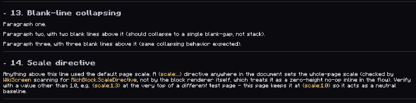
## 13. Blank-line collapsing
Paragraph one.
Paragraph two, with two blank lines above it (should collapse to a single blank-gap, not stack).
Paragraph three, with three blank lines above it (same collapsing behavior expected).
---
## 14. Scale directive
Anything above this line used the default page scale. A `{scale:...}` directive anywhere in the document sets
the whole-page scale (checked by `WikiScreen` scanning for `RichBlock.ScaleDirective`, not by the block
renderer itself, which treats it as a zero-height no-op inline in the flow). Verify with a value other than
1.0, e.g. `{scale:1.3}` at the very top of a *different* test page - this page keeps it at `{scale:1.0}` so
it acts as a neutral baseline.
---